Control Panel Graphing
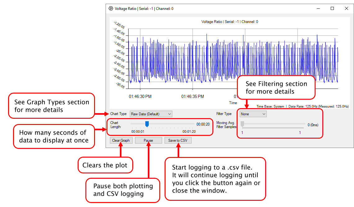
In the Phidget Control Panel, open the channel for your device and click on the ![]() icon next to the data type that you want to plot. This will open up a new window:
icon next to the data type that you want to plot. This will open up a new window:
If you need more complex functionality such as logging multiple sensors to the same sheet or performing calculations on the data, you'll need to write your own program. Generally this will involve addressing the correct channel, opening it, and then creating an Event Handler and adding graphing/logging code to it.
The quickest way to get started is to download some sample code for your desired programming language and then search google for logging or plotting in that language (e.g. "how to log to csv in python") and add the code to the existing change handler.
Filtering
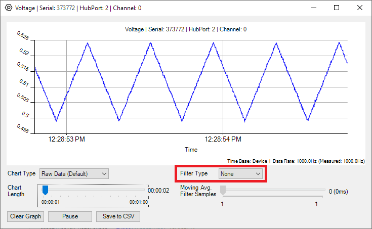
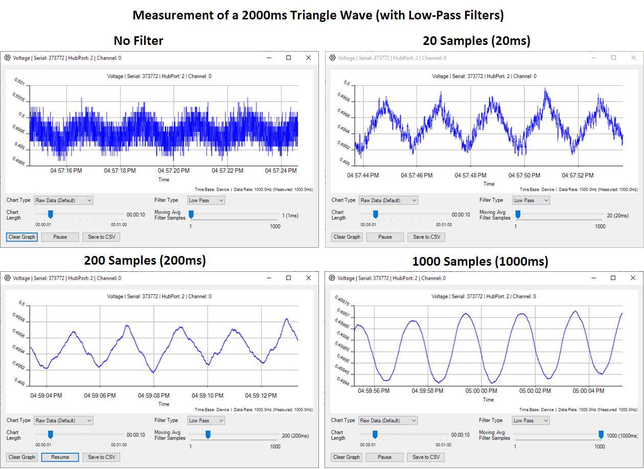
You can perform filtering on the raw data in order to reduce noise in your graph.
Low-Pass Filter
This filter looks at the frequency spectrum of the incoming data and blocks only the high frequencies. It's generally used to smooth out your graph since most noise sources are high-frequency. Select "Low Pass Filter" from the drop down menu and move the slider to select the averaging window. The larger the averaging window, the smoother the line will be.
High-Pass Filter
Unlike the low-pass filter, this filter is used specifically to look at the high-frequency noise in your signal. Select "High Pass Filter" from the drop down menu to see the noise.
Graph Type
You can perform a transform on the incoming data to get different graph types that may provide insights into your sensor data.